The Back Story
www.maxbupa.com is the online manifestation of the partnership between Max Healthcare and Bupa Finance PLC UK, with Olive global. Both Max and Bupa, come from the oasis of health sector, and are among the few, who’s vision and achievements through the years have aligned into multi-pronged success. The coming together of these healthcare giants, Bupa with all its six decades plus glory and experience and Max with its acute local intelligence and knowledge, had to materialize online in a manner that mobilized their expertise, philosophies and services simultaneously and seamlessly. Already paired with a technology partner, Max Bupa were looking for a design and UX partner who could deliver and absorb their vision of being ‘the most admired health insurance company in India’, online.
Click your Way to Great Health!
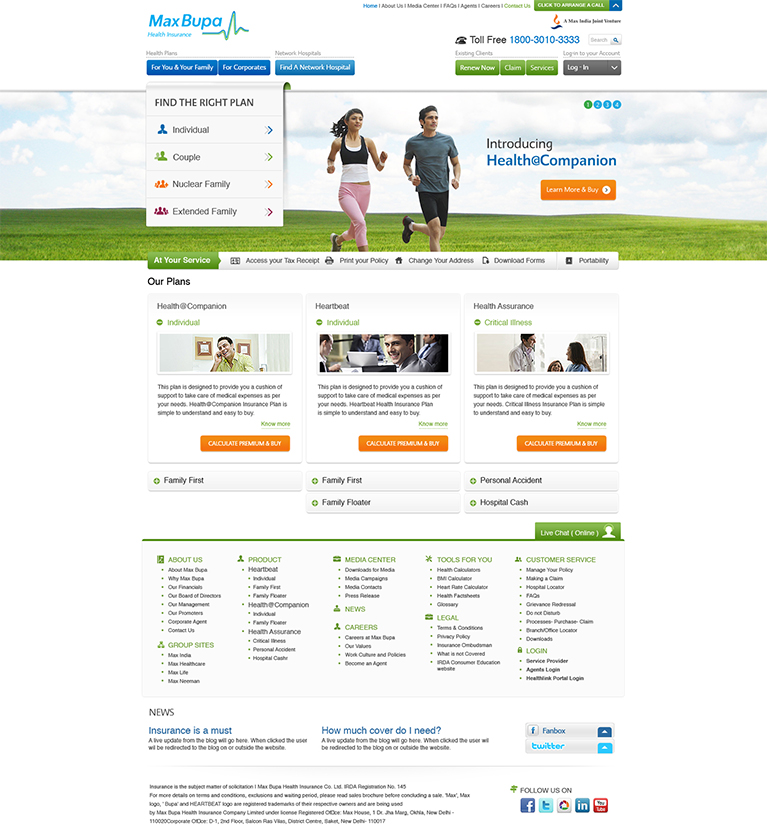
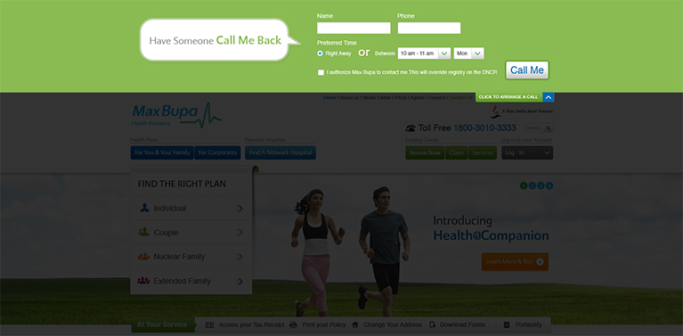
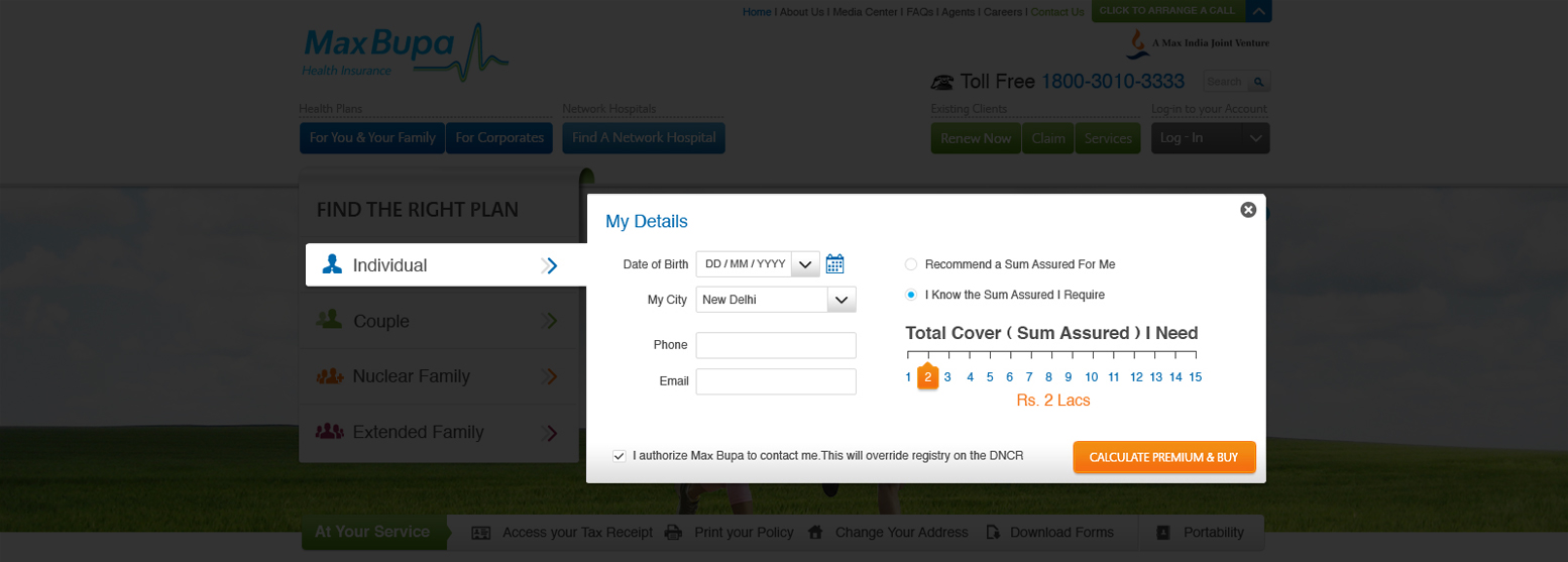
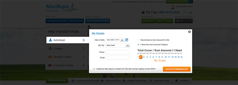
Max Bupa essentially being a health insurance company had to be understood first in the context of their services and philosophies. We worked in line with their aspiration of ‘being the most admired’, taking design cues from the motto and beginning to create a design that was extremely user friendly. The UI of the website design was structured to make each click incur a value to the user and reduce unnecessary clicks so that every click had a meaning and gave the user a seamless journey across the website.
Proper segregation of services according to their frequency of use, importance and value was done and placed in the website to maximize a user’s convenience when browsing through the website. The color tone was kept largely white and green with streaks of blue so that it was in line with the branding guidelines. The color scheme and the design were worked upon closely to instill a sense of safety and assurance to the user who can then relate it to the brand.
From Creation to Execution, a Loyal Assurance
After completion of the design, we worked very closely with Max Bupa’s technology partner, to ensure that a complete and true picture of the design that the management zeroed in on was executed to its full potential, and that no elements were left disconnected. We discussed and briefed them about the vision of the user experience, its true essence as the brand’s online projection and what we hoped to generate through the website. This led to a thorough execution of the website with the technology and the design aspects running in perfect harmony.
Our Take Away
We completed this project in a record time of three months, in retrospect it dawns on us that it was achieved not just through mere intuition and hunch and unrelenting hard work, but also through a management at the client’s end who kept themselves involved in the process, and understood the 5W’s (When, What, Who Where and Why?) and Single H(How?) of the design.


